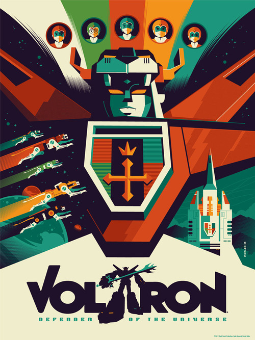

As I’m sure most of you could tell, I’ve been pretty busy over the past few weeks and haven’t had as much time to share my design inspiration as usual. I recently came across the above design and wanted to feature it, as I think it highlights a unique trend that I’ve noticed. Today’s design inspiration is a modern take on Voltron, Defender of the Universe and it focuses on the emergence of flat design. As anyone who is a designer may know, flat design is really “in” when it comes to web design. Now typically, different mediums have their own unique style that happens to be popular at a certain time and certain elements will transfer over to new mediums. What I’ve noticed here is that flat design is making it’s way into other mediums and it’s doing it pretty quickly compared to previous trends. I’ve talked about a video featuring flat design which I thought was interesting, but now I’ve been seeing more and more flat design make its way into print designs as well.
Before this emerging flat era in web design, there was the skeuomorphic design era. This included heavy use of textures, glossy buttons, use of drop shadows to give the illusion of depth, and other elements that were used to give designs the illusion that they were something that they really weren’t. Now this style definitely made it’s way into some print designs and what most of you may be familiar with: app designs and UI elements, however in some instances the elements weren’t able to be transferred into other mediums. If you take a look at what flat design is, you’ll see why it’s quickly making its way into other mediums so quickly. In short, flat design strips down elements into their most simplistic form. Gradients have been replaced with simple layered shapes in one color, just varying the hue of sections. For example, look at the design above. There’s no “reflections” on buttons, there’s no texture added to any elements, the designs take on more of a matte color/style rather than a flashy style. There’s really only two main colors used to create Voltron, however additional darker hues are used to give the design more detail. There’s no gradients, no drop shadows, just solid blocks of color.
I’m personally a fan of the new flat design and have done a few projects (some even going back months) using this style. I’ve always like minimalistic things, whether it’s my work area, interior design, a logo, anything really – so it was pretty natural me to adopt this new trend. Unfortunately that’s what it is though, a trend. It will inevitably come and go with time. It looks like for now, flat design is really just taking off though and will be around for a little while. How do you feel about flat design, love it or loathe it? Let me know in the comments below!
(image via Serial Thriller)